Race Suit Sponsor Logo Placement
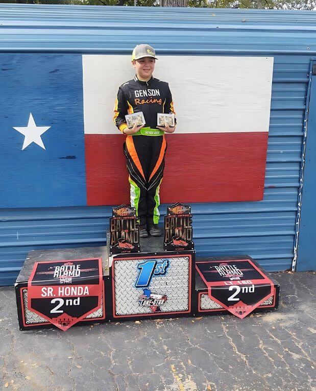
Race suit sponsor logos earn their value through placement, not just presence. The most valuable spots are the ones a camera sees most: the upper chest for your title sponsor, both shoulders for co-sponsors, the upper back for the podium frame, and the thighs for supporting partners. Put a logo where the lens points and it works; bury it on a lower leg and it’s wasted ink.
This guide gives you the definitive placement map, how to size logos for impact, how many is too many, the file formats you need to submit, embroidery vs sublimated print, and how it all comes together on a custom race suit built to your design.
- Chest, shoulders, upper back & thighs are the prime zones
- Hierarchy beats clutter — value the camera can read
- Send vector art; logos are built into the suit, not stickered on
Chest = Title
Highest-value spot
Camera Decides
Visibility = value
Size by Zone
Hierarchy, not clutter
Built Into the Suit
Not stickers or patches
The highest-value logo spots
The four prime zones for race suit sponsor logos are the upper chest, both shoulders, the upper back and the thighs. Below is each zone, the visibility it commands and the kind of sponsor it’s built for — your hierarchy in one glance.
| Zone | Visibility tier | Best for |
|---|---|---|
| Upper chest | Tier 1 · prime | Title / primary sponsor — faces the camera in every cockpit and grid shot |
| Shoulders (both) | Tier 1 · prime | Co-sponsors — visible from the side, on the grid and in pit interviews |
| Upper back | Tier 1 · prime | Primary or series logo — the dominant podium and helmet-cam frame |
| Thighs (both) | Tier 2 · strong | Supporting sponsors — seen seated in the car and walking the paddock |
| Collar / chest tab | Tier 2 · strong | Class or contingency decals required by your rulebook |
| Forearms / cuffs | Tier 3 · accent | Smaller partners — visible on the wheel and during interviews |
| Lower legs / ankles | Tier 3 · accent | Overflow logos and product partners once prime zones are filled |
Prime zones first — fill the chest, shoulders and back before anything drops to a leg.
Why placement matters
A sponsor pays for visibility, and on a race suit visibility is decided by where the cameras point. In-car and grid cameras frame the chest and shoulders; the podium and follow-cam frame the upper back; pit and paddock shots catch the thighs as the driver moves. A logo in those frames gets seen thousands of times a weekend — the same logo on a lower leg barely registers.
That’s why placement is a hierarchy decision, not decoration. Match each sponsor’s spend to a zone’s exposure, keep the most-seen spots for your biggest partners, and the suit does the job a sponsor is actually paying for — clean, readable brand presence in the shots that get shared.
See the design process →The race suit placement map
This is the placement map — every sponsor zone on the suit, ranked by how much a camera actually sees it. Tier 1 (prime) faces the lens constantly; Tier 3 (accent) is overflow. Place your biggest logos in the brightest zones and work down.
Zones ranked by visibility
- Upper chestTier 1 · prime~95%
- Shoulders (both)Tier 1 · prime~88%
- Thighs (both)Tier 2 · strong~70%
- Forearms / cuffsTier 3 · accent~45%
- Upper backTier 1 · prime~85%
Tier 1 faces the camera in nearly every shot — keep it for your title and co-sponsors. Tier 3 is overflow: real, but only worth filling once the prime zones are spoken for.
A back logo doesn’t show on a front silhouette — but on the podium it’s the most-seen panel of all.
Sizing logos for impact
A logo only works if a camera can read it, so size each one to its zone — biggest on the chest, smaller as value drops. Here are the prime zones in depth, the visibility each commands and the sponsor each is built for.
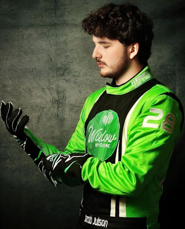
The single most valuable real estate on the suit. It faces the in-car and grid cameras in nearly every shot and reads clearly on broadcast, so it’s where your title or primary sponsor belongs — one bold logo, never a cluster.
A matched pair that stays in frame from the side — the angle used for grid walks, pit interviews and pre-race intros. Ideal for two co-sponsors or a sponsor mirrored on both shoulders for balance.
The dominant frame on the podium, in helmet-cam following shots and as a driver walks away from the car. A large primary or series logo here owns the celebration photos that get shared the most.
Highly visible while the driver is seated in the cockpit and on foot in the paddock. A strong second tier for supporting sponsors, sized a step down from the chest so the hierarchy stays obvious.
Logo zones ranked by camera visibility
Relative exposure · 0 → 100%As a rule of thumb: a chest title logo runs ~4–6 inches wide, shoulders and back sit in the same range, thighs drop to ~3–4 inches, and forearm accents to ~2–3 inches. Proportional sizing is what reads as a pro team rather than a sticker bomb.
How many logos is too many?
A clean suit holds about 6–10 logos before each one starts to lose impact — the limit is legibility, not physical space. You can physically fit thirty small marks on a suit, but a camera can’t read them, so the brand value collapses. Ten logos no one can make out are worth less than three a viewer remembers.
Build the layout by priority: fill the prime zones first, give your biggest partner room to breathe on the chest, then add co-sponsors and support down the tiers. Leave deliberate negative space — it’s what makes the logos that are there look intentional and valuable rather than crammed.
How to design a race suit →File formats & quality you need
A logo prints only as well as the file you send — vector art scales to any size with crisp edges and exact brand colors. Here’s what reproduces cleanly on a suit and what falls apart when it’s enlarged.
Best: vector art (.AI · .EPS · .SVG · layered .PDF)
Vectors scale to any size without blur, hold sharp edges and let us match brand colors exactly. This is the format that makes a logo look factory-printed at every size on the suit.
Acceptable: high-res transparent PNG
If no vector exists, a 300 DPI-or-larger PNG with a transparent background works for small-to-medium logos. The bigger the source pixels, the safer it scales — under-size it and the chest logo pixelates.
Avoid: screenshots, web JPEGs, logos off a website
Low-resolution and compressed images pixelate when enlarged and their colors shift in print. A logo lifted from a website is almost always too small for a suit panel and will look fuzzy on camera.
Note the exact colors
Send brand color codes (Pantone / CMYK / HEX) where you have them. Sublimation can hit precise colors, but only if we know the target — guessing risks an off-brand red or a washed-out blue.
No clean file? We’ll flag it on your mockup and help redraw it before anything is built.
Embroidery vs sublimated print
Most logos on a modern custom suit are sublimated print — dyed into the fabric with no weight, no edges and unlimited color — while embroidery adds a raised, premium feel for a hero mark. Many suits mix both. Here’s how they compare.
| Factor | Sublimated print | Embroidery |
|---|---|---|
| Look & feel | Flat, seamless, part of the fabric | Raised, tactile, premium |
| Color & detail | Unlimited colors, fine detail & gradients | Limited colors; struggles with tiny text |
| Weight & comfort | Adds zero weight or stiffness | Adds thread weight & a slightly stiffer patch |
| Durability | Won’t peel, crack or fade with the fabric | Very durable; thread can snag over time |
| Best use | Most logos — small to large, multicolor | A single hero / primary logo for prestige |
The default is print for clarity and comfort — embroidery is the upgrade for a signature mark.
Sublimated print
The design is dyed into the certified outer layer, so the logo is part of the suit — no edges to peel, no added weight, and any color or gradient your brand needs.
Embroidery
Raised fire-resistant thread gives a hero logo a premium, tactile finish. Best on bold, simple marks — fine text and many colors are where it struggles.
Fire-safe either way
Sublimation doesn’t add material, and any embroidery or patch uses FR thread and backing applied so the suit stays SFI-certified with logos in place.
How this works on a custom suit
On a custom suit, logos aren’t stickers added at the end — they’re designed into the panels from the start. Here’s the path from your sponsor list to an approved mockup to a built suit with every logo in place.
Map zones to sponsors
We start from your sponsor list and your rulebook’s required decals, then assign each logo to a zone by value — title to the chest, co-sponsors to the shoulders, support to the thighs. Hierarchy is decided before a single panel is drawn.
Lay it into the design
Logos are placed directly into the panel artwork so they sit flat on a seam-free area, scale with the suit and never fight the base livery. You see every logo in position on your free mockup before anything is cut.
Choose embroidery or print
Each logo is set as sublimated print (any color, no edges, no weight) or as raised embroidery for a premium tactile mark. We flag any logo whose file or colors won’t reproduce cleanly so it’s fixed before production.
Proof, approve, build
You approve the final mockup with every sponsor in place. The suit is then built to your exact measurements with the logos baked into the design — not stickers or patches added later that peel in the wash.
Logos are part of the artwork — which starts with the design itself: how to design a race suit →
Built into a certified suit
Every FervoGear suit is made to the SFI 3.2A standard — the most-ordered build independently certified at 3.2A/5 — with your sponsor logos sublimated into the certified outer layer so the suit stays tech-legal with every mark in place. You see the full layout on a free mockup before anything is cut.
You get a sewn-in SFI tag a tech inspector can verify, a clean professional logo layout, and a suit cut to your exact measurements and design.
Custom SFI-5 race suits →Everything above is the framework — these are the edge-case questions teams ask once they’re placing real sponsors.
Sponsor logo questions
Where should my main sponsor logo go on a race suit?
How many sponsor logos can fit on a race suit?
What file format do I need to send for a sponsor logo?
Should sponsor logos be embroidered or printed?
Can I add or change sponsor logos after the suit is made?
Do sponsor logos affect the SFI fire rating of the suit?
What size should a sponsor logo be on a race suit?
Where do required contingency or class decals have to go?
Ready to lay out your sponsors? Start with how to design a race suit →
See your sponsor logos on the suit
Send us your sponsor list and logo files — we’ll lay them into a clean, camera-ready design and show you the mockup in ~3 hours, built in 3.5 weeks.